Build the exact Asana dashboards and reports you want with Velocity
Note: If you buy something linked to in one of our posts, we may get a small share of the sale.
Asana is a fantastic tool, but one area where some teams (especially engineering teams) get frustrated is the very limited built-in reporting. Asana’s reporting and exporting features are unfortunately very basic.
- You can export data into a CSV file by project, but it’s formatted poorly and the tasks (and subtasks) don’t appear in any discernible order. Or…
- You can print a list view or save it as a PDF, but it’s not customizable at all so you’re forced to print subtasks and task descriptions that you’d rather not.
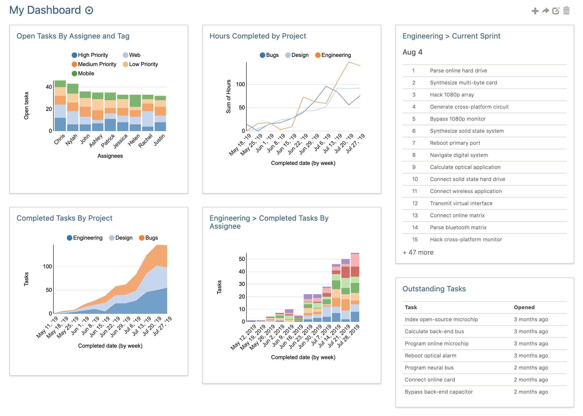
We recently had the chance to talk with Tom Benner, the founder of Velocity. Velocity helps teams create custom dashboards and reports for Asana in a slick, easy-to-use interface. Velocity states some of their notable customers include Dropbox, Cisco, and Spotify.
Some of the specific features of Velocity we thought were noteworthy include:
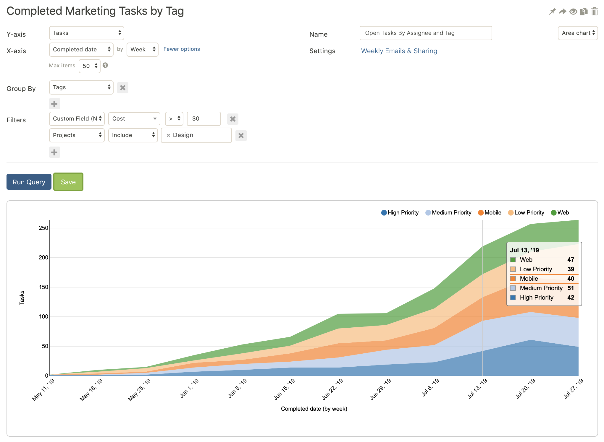
- Visualize Asana data in customizable charts. There is a lot of flexibility in how you want to display data.
- Compute results based on numerical Custom Fields. You can find the sum, average, minimum, or maximum values. For example, see how many story points you completed in a week, or the average time to complete a type of task.
- TV dashboard view. Create a live dashboard to display in your office to keep people on track.
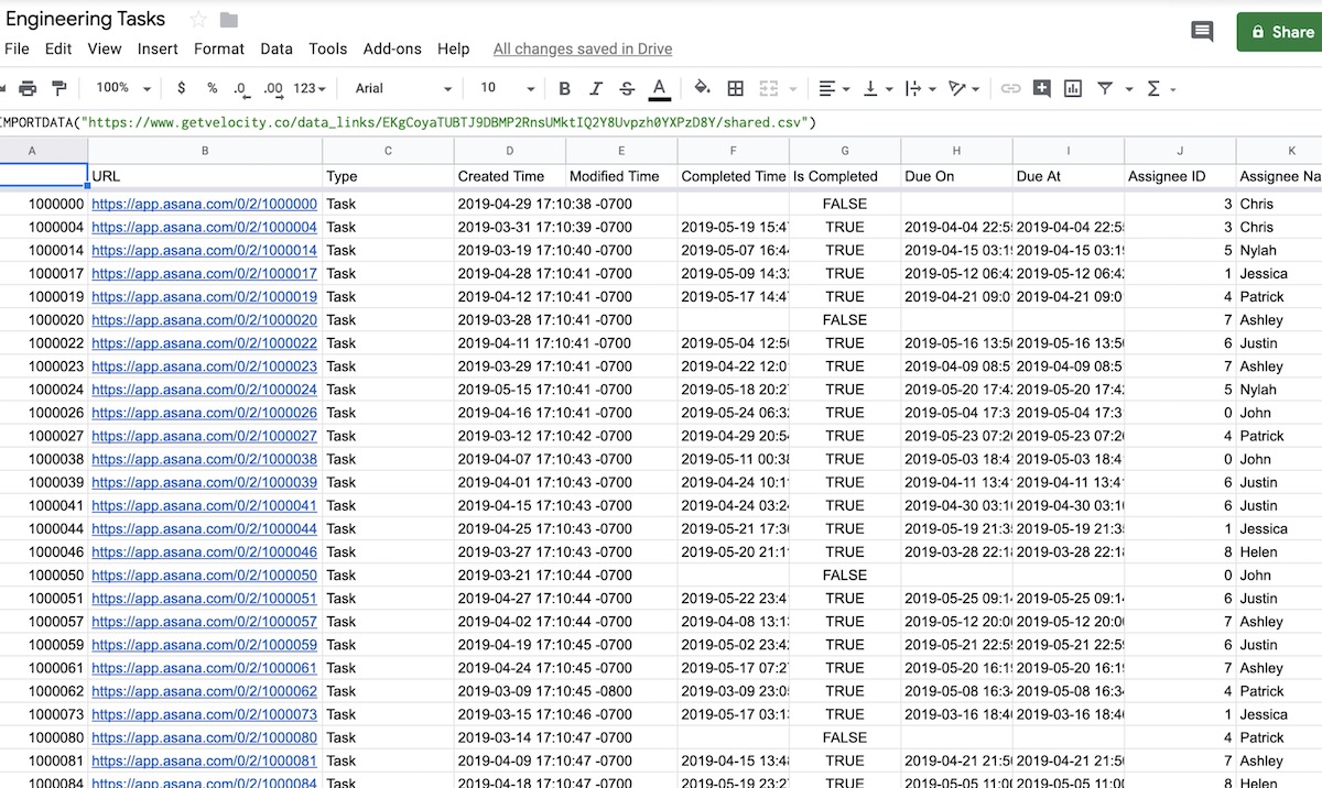
- Connect your Asana data to Power BI, Google Sheets, or other powerful data tools. With this, the sky is the limit for how you can process your data.
- It’s fast. It processes large projects quickly, something other tools can struggle with.
Velocity offers a 30-day free trial. After that, pricing starts at $15/month when purchasing annually.


