Review: Asana’s new iOS app
Note: If you buy something linked to in one of our posts, we may get a small share of the sale.
A couple years ago, after much research, I decided to start using Asana to help me effectively get things done. The easy task-input interface and cloud sync were two of the main things that sold me on making the switch. I liked it so much that I changed my entire organization over from another productivity app we were already using.
But even as Asana has introduced tons of fantastic new features since that time, there has still been one major aspect that was lacking—the mobile app. There has been one available, but it lacked the functionality and modern design of most popular apps. Thankfully, the team over at Asana recently gave the app a major redesign.
Gone are the days of the app looking just like the mobile website version in a wrapper (which looked a lot like 2010), and in its place is a more polished version that looks ready for 2014 and has a simple, intuitive interface. Honestly, now I wouldn’t mind if the website got a redesign to match the aesthetics of the new app. So, let’s dig in and I’ll tell you everything you need to know so you can get back to getting things done!
Understanding the Layout
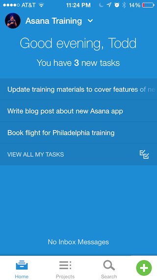
Once you sign in, it’s pretty easy to find your way around. On the home screen are all your tasks and a way to see if you have any inbox messages. At the bottom you can toggle between home, projects, search or use the green + button to create a new task. Creating a task is so simple that it takes hardly any time.
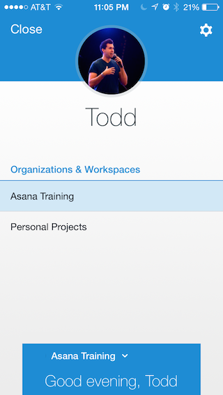
Tapping on the name of the current project in the top left (next to your profile picture) shows all your different organizations and workspaces. It’s so simple to navigate that you’ll know the basics within 5 minutes.
Getting to Work
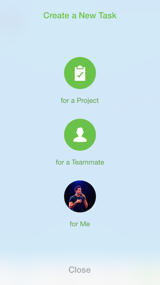
When you create a task, you’re given the choice of adding a task for a project, a teammate, or for yourself. I thought this was a clever way of setting up new tasks. Whichever one you choose you’ll be able to select the necessary details, such as project or who you will assign the task to, but by giving you the choice right from the beginning it allows you to quickly create a task based on how your mind is thinking of it in the moment.
For instance, sometimes I think, “I want John to take care of marketing our new initiative.” In this case I would use the button for adding a task for a teammate. Other times I think, “I really should work on a new blog post for the website.” In that case I would either use the button to add a task for a project or for myself. It’s a creative way to keep you working as fast as possible so you’re not getting tied up with the details of inputting your tasks. This was my favorite part of the new app.
Better Design
Besides one major gripe below, the entire app seems like it was well thought out. It feels much more like it was designed with the user in mind.
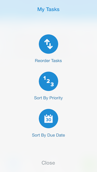
A perfect example of this is the way you can view tasks. In the old app, I always found the search function to be limited and the views felt cluttered. Now you can see all tasks by tapping “view all my tasks” from the home screen, then tap the three dots (…) at top right to reorder tasks, sort by priority, or sort by due date. Unfortunately, I still couldn’t find a good way to determine priority of a task (new, upcoming, later) in the app. It seems that still needs to be done on the desktop version.
Some Issues
My biggest issue with the new app is the Home screen. I actually wrote another blog post about what I would change. I really feel they dropped the ball on this one from a UI/UX perspective. Using 25% of the screen real estate to tell me “Good Morning/Afternoon/Evening” and tell me how many tasks I have due today (even when I can see exactly what’s due below) is a waste of space. A better option would have been to merge the “view all tasks” screen with the “homescreen” and make the “View Read Messages” text-button an actual icon in the menu bar.
For those who are heavy users and want to get picky, there are also some minor things that could use work. The lack of ability to determine priority of a task like I mentioned above is one thing.
The other problem I frequently encountered was that the app didn’t update by showing new tasks on the home screen as fast as I would like. I usually had to switch between tabs on the bottom and then (most of the time) it would show up. Also, when I sorted my tasks it didn’t always seem to take effect when I went back to the home screen.
Verdict: A Solid Solution
For a company that has produced such an amazing web product, I kind of wish the app homescreen would have been a little better thought out. But overall, the app has been substantially improved and I feel even better about my choice to use Asana as my to-do list. The Asana team is regularly issuing updates for the platform and has really put out a solid update for the app. If your team is on the go often, they’ll be happy with the improvements made here.


